ShopDreamUp AI ArtDreamUp
Deviation Actions


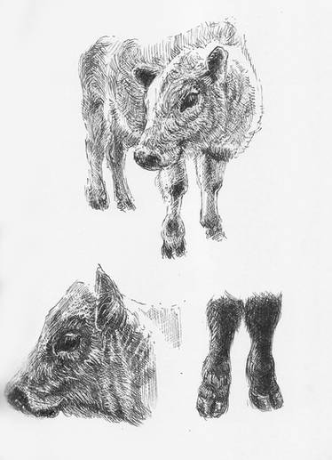
Above left to right: exercises in rendering (1 and 2) and tonal scheme (3).
____________________________________________________________________________________________
INKVEMBER: To my surprise the focus remained on inking. I think that's because I experienced the thrill of improvement in all areas during Inktober. The lines became more definite, deliberate and confident, which, in turn, seemed to lend authority to implementing recommended changes noted in critique. In this I took direction from Bob McLeod's generation to "finish" as I saw fit by redrawing, reorganizing and designing as needed. Granted, this time around I didn't actually take the liberty of redrawing someone else's penciled work, though I made notes on what I thought should be redrawn. I didn't do it because there was too much to occupy me studying rendering techniques and noodling with composition and design. But one day soon action will replace notes, because it's easier to correct problematic drawing on the fly, spontaneously, than to work around it.
For much of the week I stuck to inking over pencils by John Buscema and copying his inks. Slowly - very slowly - I got the hang of transitioning from one medium to the other, until I picked up the difference between drawing directly and "naturally", on one hand, and using design elements for style, on the other. The simplest design elements are, perhaps, line shapes, which then combine to form other shapes. For example, a tapered line is it's own design. Put several next to each other feathered to black and they can make bear claws or, what Manga calls "flashes." The trick of style is to define such designs well, use them consistently and build upon them. In that sense they are like letters in the alphabet, or base numbers in a counting system. In the strongest inking styles, everything in the finish is reducible to these primitive elements.
Elements of design show up even in completely realistic, natural, or direct, rendering, which makes it possible to draw by rhythmic patterns, instead of by copying. What looks as if it's copied straight from nature is, in fact, a translation of a specific condition of form-under-light into abstract patterns via rhythm. This is what we do when rendering hair - we translate via rhythm. The most realistic rendering is - and must be - an illusion created by abstract patterns. Whether these patterns are further abstracted to simplify them, and recombined to express other things, determines the relative proportion of design to realism in the style of drawing and rendering. But design is ALWAYS in the mix. There is no way around it. So, why fight it - especially if learning to use it makes one better at drawing, overall, including realistically?
Classic Ink: The illustrators of the late 18th to early 19th centuries are the undisputed masters of pen and ink. I reviewed their work, again, briefly this week - this time under a microscope. This time I think I penetrated the illusions and was surprised at what supported them. I am still in awe of their work, though at the same time surprised and a little disappointed to discover how certain effects result. For example, I did not realize that wash is often applied to help grade hatch tones. This is something I noticed copying Frank Frazetta's pieces for Inktober. Apparently it's a traditional technique.
Another thing I looked at was black white reversal and what could be called "OCD" hatchwork. The first is a way to work with dark grays and the second pushes that into spotting. Spotting with a pen!
The examples I studied are in the book, Ancient and Medieval Arms: A Pictorial Archive from Nineteenth-Century Sources, by Carol Belanger Grafton. Also, The American Drawing Book by John Gadsby Chapman provides meticulous instruction for drawing both in pencil and pen and is loaded with examples of classic pen illustration. If you want to wipe the slate clean and start with exercises on how to draw well controlled lines, this is the book for you. (Every so often I return to this book to train my hand, but can't get past the first few exercises.)
Rehab Update: Still treating the bites on the left leg, waiting for the wounds to close fully. Until they do, can't exercise, bicycle, wear the leg brace, or use the inversion table at the risk of tearing them open. It's been a long time of enforced inactivity that's driving me crazy. Of course, the flip side is that it paved the road for the return to art in general and to digital inking in particular. So, no complaints. The only thing is that I need to exercise soon before I lose all my leg strength. Hoping I can do that in another two weeks. When you hear "dog bite" you don't think of a major injury. But that depends on what's doing the biting and what's being bitten. LOL. XD
_________________________________________
NOTES
* Don't know how long this run on inking will last. It does seem as if it's going deep. Will it fan out into sequential work or jump back to painting, or to something else? I don't have a clue. For now I'm still all in, attempting to satisfy a hunger for good rendering and panel composition. I will say that in the back of mind there is this yen to work out original stories. But, that's always there, so I don't know if it portends a change in that direction. It seems I'm always rebuffed when I go that way. Still, who knows? Anything can happen.
* Hey! I need your critique. If you have a reaction to the work, I'm interested in hearing about it - good and bad. If you have opinions, share them, too. And if you have knowledge and skill to share - JACKPOT - that's even better! (I'll be watching you!) So, don't be shy. Critique and comment, give and receive. I highly recommend it. That's how we grow.
__________________________________________
REFERENCE
Carol Belanger Grafton Ancient and Medieval Arms: A Pictorial Archive from Nineteenth-Century Sources NY, 1995
John Gadsby Chapman The American Drawing Book NY, 1847
Quarterly Review- 1st QTR
Quarterly Progress Report: IMHO the first quarter was a monster! It involved challenging work that paid off rapidly. Funny how little time it took, though it seemed to go on with no end in sight. Relearning how to draw heads frustrated me intensely. At times I felt as if the lessons didn't work, and then when they did, the knowledge and skill didn't take hold. But, in the end, not only did training get me back to where I was before the break; it raised the baseline appreciably. I know more about the subject now than before and have increased the skill required to do it better. Thanks to my head drawing bootcamp, I went from, 'how do you do this, again?' up to passable generic heads and faces, and up again to serious portraiture. And that's just heads! I progressed in other areas as well, so I'm happy. Of course, along with the concentrated study, I changed the daily exercise from figure drawing to drawing heads, which changed its duration from twenty minutes to several
Fatal Error (BSOD)
Fatal Error: The world is impinging on my studio time, which tells me I must be doing something right. LOL. The blue screen of death (BSOD) fatal error occurs frequently when I turn off or on the Cintiq, which is a known issue plaguing set ups of multiple monitors. The error code is DXGKRNL, but what do I do about it? IDK. What is the exact cause? IDK. It started happening second week of Aprill. I thought it had to do with a Wacom tablet update, but then I saw that F.lux can cause the problem in systems with two monitors, like mine. Or is it the graphics card - NVIDIA GTX 745, a driver for which I can't locate at NVIDIA's website to download (I don't really understand graphics cards and drivers). So, I'm hoping that Windows will repair itself or correct itself with the next update. XD. Routine Modification: The closest thing to routine drawing exercise was Quick Heads, and that has been morphing. One variation that I submitted yesterday was all cartoon heads and faces
The Art of Shifting Gears
After establishing a routine, I started to loosen up and deviate from it. I replaced the daily croquis figure practice with an exercise I've been calling "quick heads," to focus on heads, faces and expressions. It usually started by posing a 3d planar head model, then moving on to one of several head and face websites I told you about. Since I couldn't find a website that displayed head and face reference by timed intervals, I used a dark room timer for that purpose and set it manually. It all worked out very well, until I started getting lost in the moment and lingering on details, then taking off on tangents to investigate other things. I decided to indulge this, since it moved things forward. For example, one of the things it introduced was the gearshift from gesture to detail, which afforded the opportunity to practice refining the hands and feet of quick sketches that normally get short shrift, and as a result, deny the practice required to draw them quickly. After trying it
Quick Heads and Faces as a New Daily Exercise
Quick Heads and Faces: Stayed the course and made the daily exercise about heads and faces. Not twenty at one or two minutes each - that has become the goal - but after a slow start I'm up to ten per session. The sessions are way longer than they should be, since I don't have a way to set timed intervals. (Well, that's one reason. lol) I'll have to take a day to rummage through the boxed up contents of my home to find the Cra-Lab timer. Had it in mind to do it today, but time is already getting short with laundry, bicycling and the journal. It's a metal box about 15 inches square and two inches deep. It's in one of 35 boxes stacked in my living room. New Resources: I found two website tools to help with the new daily exercise. At referenceangle.com, you are presented with a 3D model that you position as desired, adjust search parameters for things like, age, sex, and so on, then click the search button. You are then given pages of photo reference to meet the criteria.
© 2017 - 2024 Sol-Caninus
Comments8
Join the community to add your comment. Already a deviant? Log In
really love looking at this style - great work.